
Yesterday was full of ScanNCut news, so today I’m returning to colour, texture and the pleasure of making something by hand. I’ve been painting a series of coastal scenes in Rebelle 8 Pro while working alongside Geoff Kersey’s Take Three Colours: Watercolour Seascapes. These digital watercolours are part of a project that is still taking shape.
Learning to see a scene in layers
The book’s three-colour approach is a useful prompt to pay attention to the relationships between colours. Working digitally gives me room to test a wash, soften an edge and build another layer while keeping that painterly feel. I’m looking at the decisions that carry across both media: where to leave the lightest areas, how dark a focal point needs to be, and when to stop adding detail.
Four coastal studies
Each painting gives me a different composition to work with. In the first, boats rest beneath a soft lavender and peach sky. The second follows a quiet curve of sand towards the water.
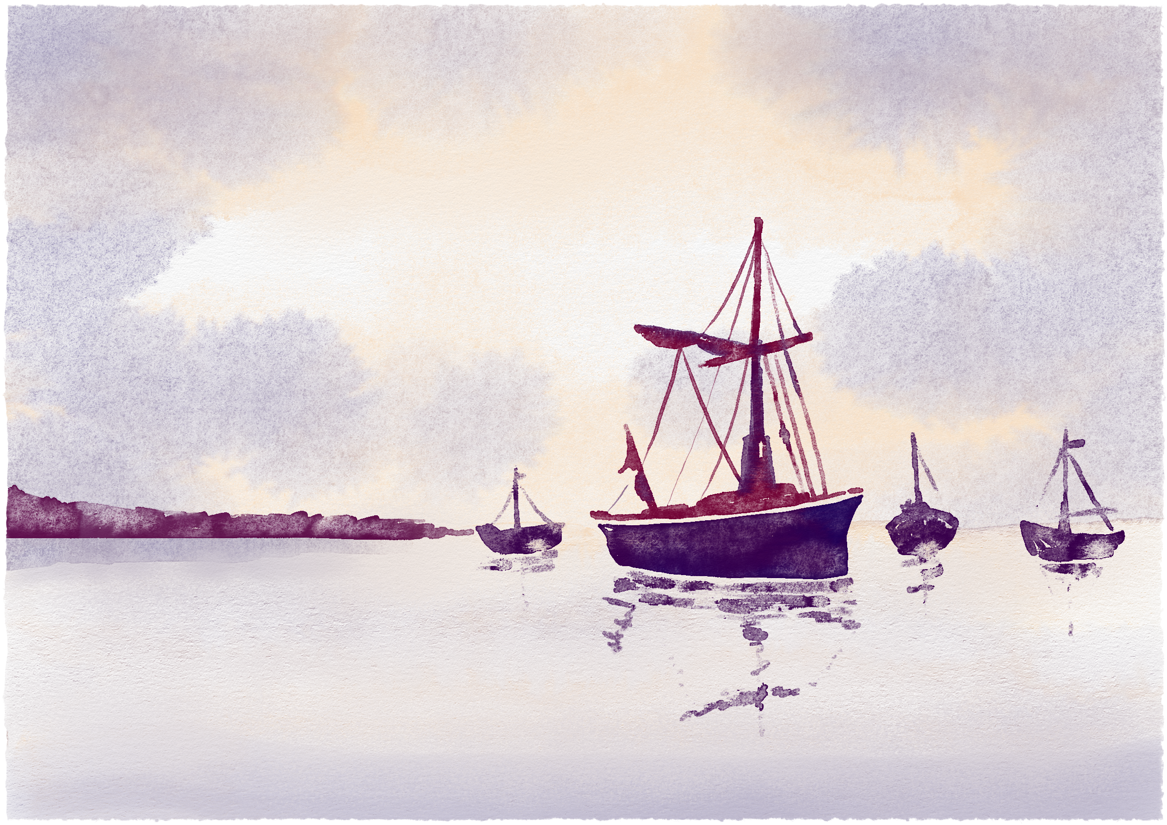
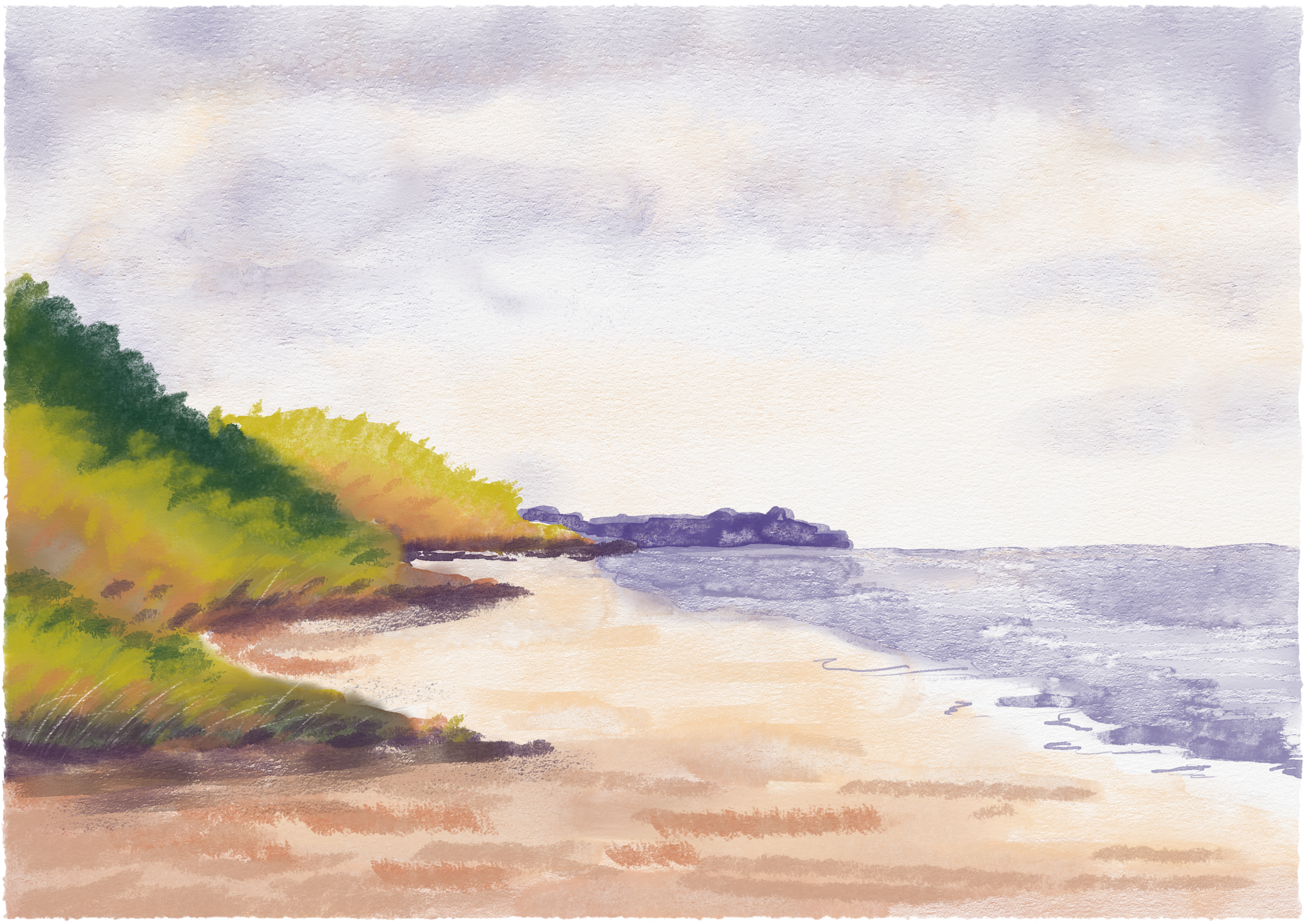
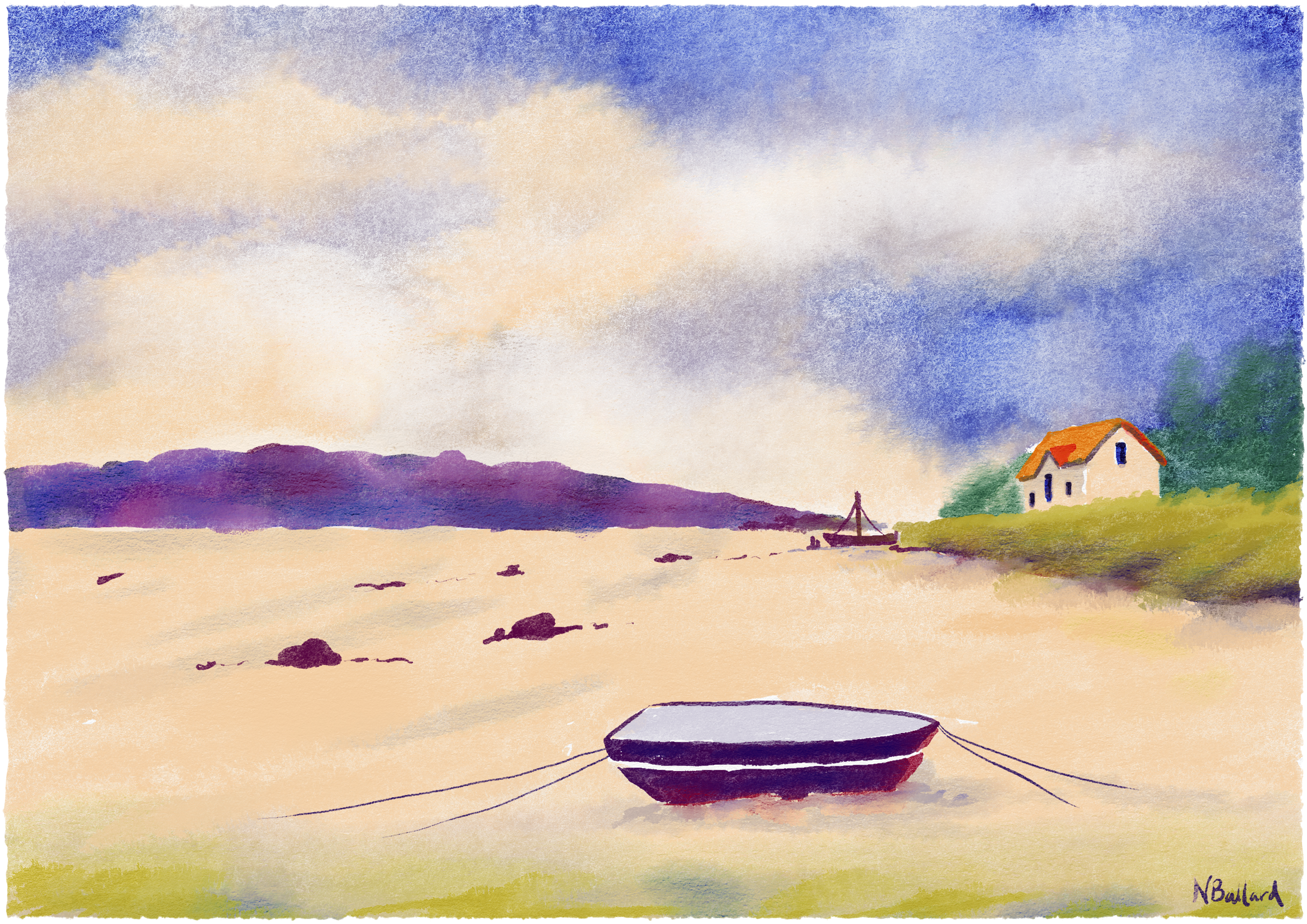
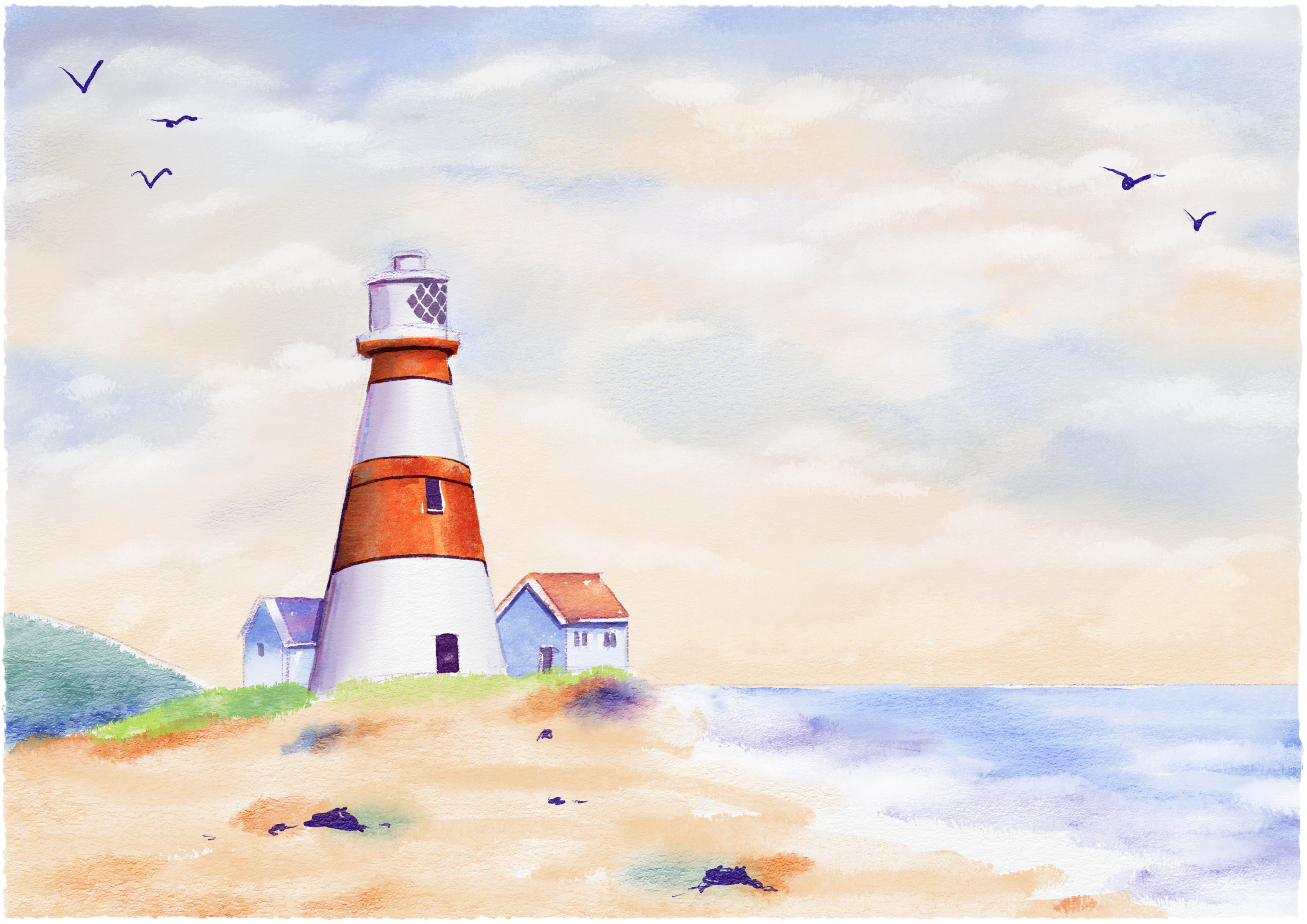
The third scene uses a moored boat in the foreground to lead the eye across the bay. In the fourth, the lighthouse gives the open shoreline a strong point of focus. Seeing the paintings together is helping me decide which marks and colours are worth carrying into a printed project.
Where the papercrafting begins
The next step is to bring these paintings off the screen. I want to try small prints as the centre of handmade cards, mounted on cardstock with a narrow border. A simple sentiment could sit below the image rather than across it, leaving the sky and shoreline open. The quieter scenes might also work as journal covers or title panels for a scrapbook page.
If you try this with your own art, make one test print first. Check how the pale washes and darkest colours look on your chosen paper, then decide on the card size before trimming the image. Let the picture do most of the work: one thoughtful paper layer can be more effective than a crowd of embellishments.
The book beside this project
Affiliate disclosure: As an Amazon Associate I earn from qualifying purchases. If you buy through either link below, I may receive a commission.
Amazon UK: paperback edition (paid link).
Amazon US: Kindle edition (paid link).
Still taking shape
These paintings are the beginning of the paper project. I’ll share what happens when the digital watercolours meet real cardstock, and which choices work best once they are printed.
Which one would you choose for a card: the boats, the beach, the bay or the lighthouse?