How to Design a Simple but Effective Page Layout


1. Start with a Focal Point
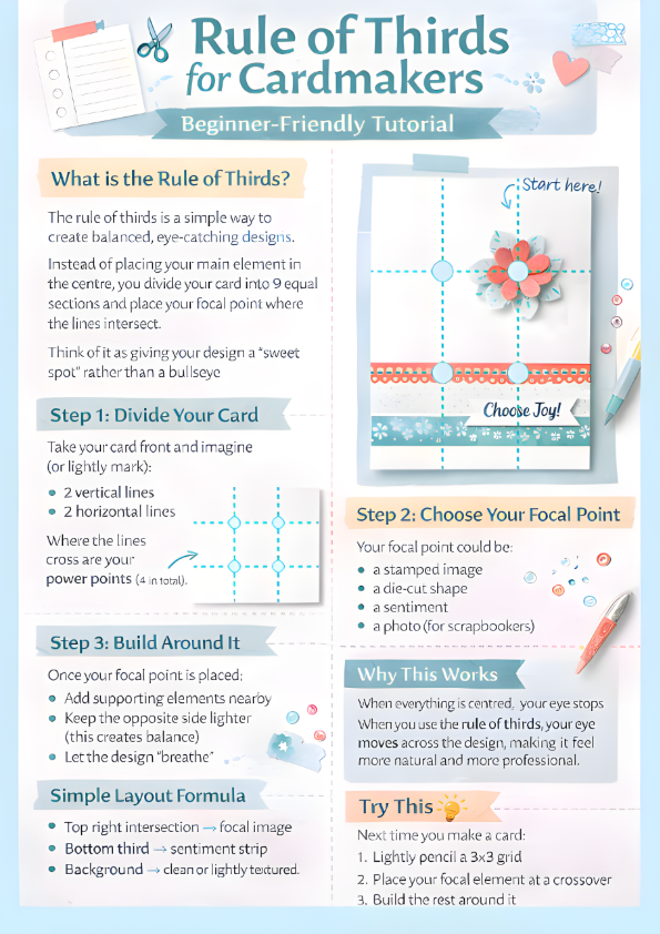
Choose one main element. On your project base mark 2 vertical and 2 horizontal line evenly spaced to create 9 equal sections. Place your focal point at one of the intersections of the rule of thirds. Have fun with its scale compared to your project base.
2. Build Around It
Add supporting elements without overcrowding. Think borders or panels onto which your focal point can punctuate
3. Keep Consistent Spacing?
Even spacing makes everything feel more professional. However, uneven spacing so no side matches can make your layout feel dynamic and full of movement.
4. Repeat Elements
Repeating shapes or colours creates cohesion. You could split a background piece into a grid or segments for example.
5. Place your sentiment
Your sentiment balances your layout, so place it on the opposite focal point crossover to your focal element. If you are selling your card, switch around the traditional rule of thirds layout so your sentiment is at the top, this will help you to sell your cards easier.
Here’s is a free Rule of Thirds download. Think of it as a small taster for what’s to come in my Layout Guide Book coming later this year (one for the Christmas List). Feel free to print it out for future reference, or why not bookmark this page.